
Black-and-white or colour portrait: how to choose
The same portrait can feel lively and contemporary in colour, then focused and emotional in black and white. That does not make either version objectively better. The right choice depends on what should attract attention: expression, light, clothing, location or a brand palette.
Instead of asking whether black-and-white or colour photos are better in general, evaluate each frame. Two neighbouring images from one portrait session may need different treatment. The following criteria help compare them without relying on myths or automatic filters.
Instead of asking whether black-and-white or colour photos are better in general, evaluate each frame. Two neighbouring images from one portrait session may need different treatment. The following criteria help compare them without relying on myths or automatic filters.
What changes when colour disappears
Without colour information, viewers notice light, shadow, facial shape, texture, composition and expression more strongly. Red clothing, a green background and skin tone become shades of grey. If their brightness is similar, details may merge. If their values differ, the subject separates clearly.
Tonal range means the path from the darkest areas of an image to the lightest. Clear tonal relationships make form easier to read. A wide range does not have to mean harsh contrast: a soft monochrome portrait can still be expressive.
Black-and-white photography also introduces abstraction. We do not literally see the world this way, so lines and emotion may receive more attention. However, monochrome is not automatically more truthful or artistic. Weak composition and accidental light remain weak after the colour is removed.
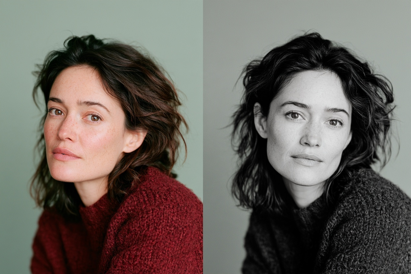
When a black-and-white portrait works particularly well
Try monochrome when light and shadow form the foundation of the image. Directional light can define the face, shoulders or texture of a garment. If patches of colour compete with the expression, translating them into grey can make the frame calmer and more coherent.
Strong emotion is another useful case. A quiet gaze, laughter or a thoughtful expression may become clearer when clothes and background no longer compete with the face. This often suits minimal, editorial and artistic portraits.
Texture can also gain importance: hair, knitwear, wood, stone or a grainy background. Yet contrast can emphasise unwanted detail too. It may make skin texture, lines and hard shadows more visible. Black and white should not be treated as an automatic way to hide imperfections.
Sometimes clothes and background clash in colour but separate well in brightness. Monochrome may simplify that image. The opposite can also happen: two different colours become almost the same grey, causing the person to blend into the background.
When colour should stay
Keep colour when it carries meaning. Makeup, eye and hair colour, coloured light, clothing, accessories, interiors and seasonal atmosphere can all be part of the story. A warm Porto street at sunset communicates something different from a neutral studio portrait because of its palette.
Colour is especially relevant to a personal brand with recognisable visual guidelines. If an expert uses a defined palette on a website and in presentations, a colour portrait may support the system more effectively. The same applies to a product or professional object whose colour is important.
Colour can also feel more documentary and immediately recognisable. A professional profile, about page or team introduction often benefits from a natural representation. This is still not a rigid rule: the platform, brand personality and surrounding content should guide the decision.
Avoid presenting colour psychology as a fixed science. Red does not always mean passion, and blue does not guarantee trust. The impression comes from colour, light, expression, composition and context working together.
Light and contrast matter more than the black-and-white switch
If the light is flat and the face, clothes and background have similar brightness, the monochrome version may look dull. Directional light and readable shadows create volume. Separation between subject and background keeps the silhouette clear without colour.
Extreme contrast is not a universal solution. Deep shadows may hide the eyes, while very bright areas pull attention away from the expression. Pores and fine lines can become more noticeable. Judge whether the treatment supports the portrait rather than whether a preset looks dramatic.
It helps to consider black and white during the shoot. Background, clothing and light can be checked for brightness as well as hue. This is different from trying to rescue an unsuccessful colour photograph by simply desaturating it.
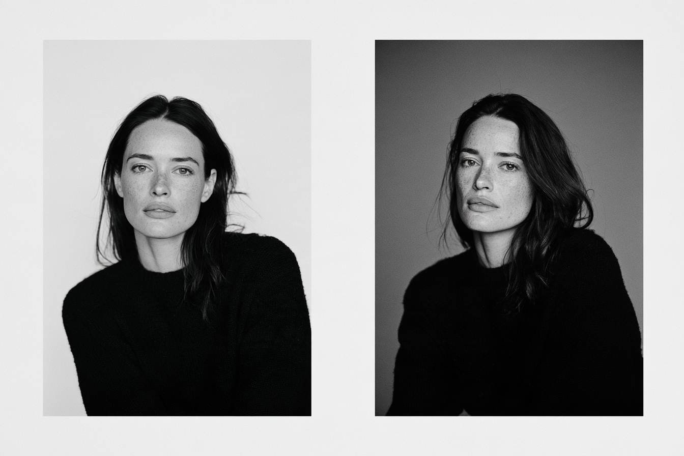
Clothes, background and makeup in colour and monochrome
Colour images depend on harmony or intentional contrast between hues. Clothing may support the background, become an accent or deliberately oppose the setting. In black and white, separation by brightness and texture is more important.
A bright red jacket and dark green wall can look clearly different in colour but convert to nearly equal grey values. The silhouette then disappears. Conversely, subtle colours may produce a well-separated tonal structure.
Makeup changes too. The actual shade of lipstick or eye shadow is removed, but its brightness relative to the skin remains. The contrast of lips, eyebrows and eyes may become stronger or weaker. If monochrome is being considered, make a test frame and compare it early.
Why reducing saturation is not enough
Good black-and-white conversion is more than setting saturation to zero. Editing software can control how bright or dark the greys derived from original reds, oranges, blues and other colours will become.
This affects skin, lips, hair, clothes and background. Adjusting the orange range can change the rendering of skin, while blue controls skies or blue garments. Adobe Lightroom includes a dedicated black-and-white mix for this purpose. The goal is a clear tonal balance, not one identical effect for every picture.
Editing should remain restrained. Artificially dark skin, clipped highlights or visible halos around the face distract from the portrait. A strong monochrome image preserves useful detail and directs attention without disguising the original photograph.
How to compare two versions of one frame
Place the colour and monochrome versions side by side. Do not switch rapidly between them. First decide what the viewer should notice, then ask four questions:
If both work, keep both for different purposes. Colour may suit a website and professional profile, while black and white supports an editorial sequence or print. Avoid publishing near-identical duplicates without a clear role.
- Does colour communicate essential information about the person, clothes, place or brand?
- Do the face and emotion become stronger without colour?
- Do skin, hair, clothing and background remain separate in grey?
- Does the version suit its intended use?
If both work, keep both for different purposes. Colour may suit a website and professional profile, while black and white supports an editorial sequence or print. Avoid publishing near-identical duplicates without a clear role.
Which format suits which purpose?
Colour often works well for avatars and professional profiles because it supports immediate recognition. A brand website should follow its wider visual language. Social media can combine both formats if the overall series remains coherent.
Editorial portraits, personal archives and prints may benefit from monochrome when form, texture and mood lead the image. But black and white does not have to look serious, and colour does not have to feel light. Emotion comes from the whole frame.
The guide to visual storytelling in photography (https://arporto-selfiestudio.com/blog/visual-storytelling-in-photography) explains how individual images form a narrative. Colour, or its absence, can help structure that sequence.
During an individual photo session (https://arporto-selfiestudio.com/individual), several looks can be photographed before any final processing decision. At AR Porto, you can create a full series with the camera and lighting ready, then compare selected frames in colour and monochrome after the shoot.
The short answer
Keep colour when it supports the story and communicates useful information. Try black and white when colour distracts and the light, form and expression become stronger without it. The best answer comes from comparing two versions of a specific portrait, not from a universal rule.
ar.portostudio@gmail.com


AR Porto Selfie Studio © 2026


Leave a request
Our manager will contact you for booking
